I do love our posh little pad. But it’s almost too posh. Every corner is planned. Every inch used to its best potential. The curtains are hung. The walls are painted. Basically, the decorator in me has nothing to do! It’s stifling! And not because it’s 100 square feet.
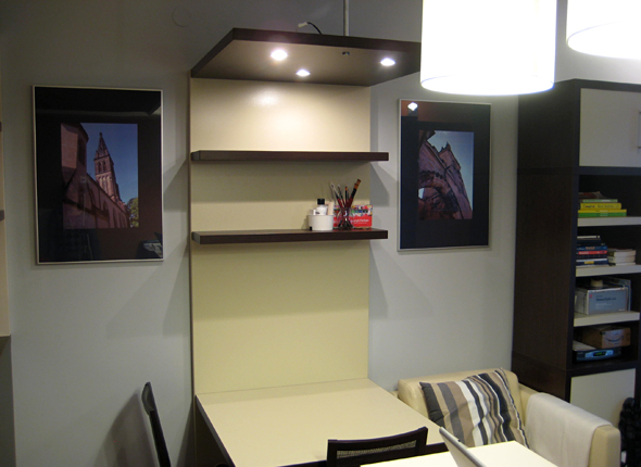
Pre-fab frames: Before
There is one thing, though. I find these photographs to be a yawn. In a city full of amazing architecture, how do you manage to choose the most boring photos of the 11th century church up the hill? So I fixed it.
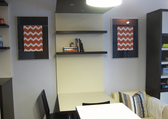
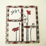
Pre-fab frames: After
And anyway, I think my graphic DIY art fits the feel of the joint much better.
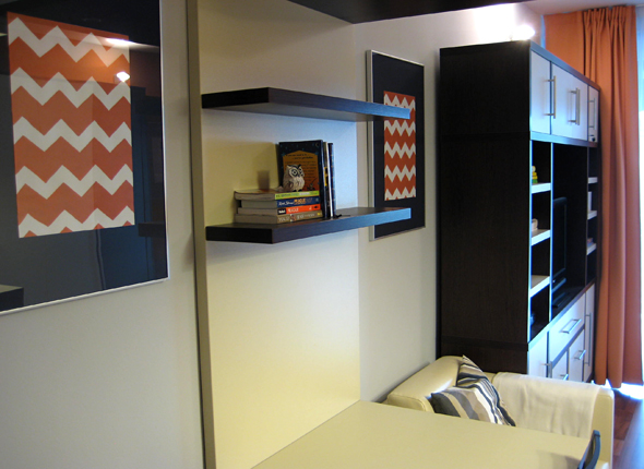
Not to mention how well they draw the orange from the curtains into the room.
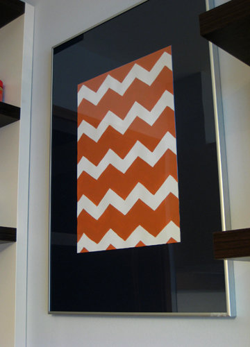
*Dusts hands.*
Now I just have to remember to remove all signs of my improvement before they deduct it from our deposit.
(For DIY chevron instructions, I hit up kelly + olive. And Jess’s chevron art at Makeunder My Life is my favorite yet.)

 I'm Amy Hadley. On HNWN! I give ideas and inspiration for organizing, decorating and homemaking. It's your home. You should love it.
  Vintage Aprons
 Modern Bathroom Mural
 Fabric Flower Collage
 Polishing Pumpkins
 Cardboard Taxidermy
 Adding Storage: Clothes rack
 Handmade Christmas Gifts
 Christmas Tablescapes
 Sweet Pillowcase Nothings
3 Comments
Nice work! Orange is definitely the Hadley color this year. So does this mean you’ll be staying a while longer?
Love your addition! Uber chic!
Love this. Zippy idea and it really changes the look of the whole space.